
Beige marble
Crema Marfil
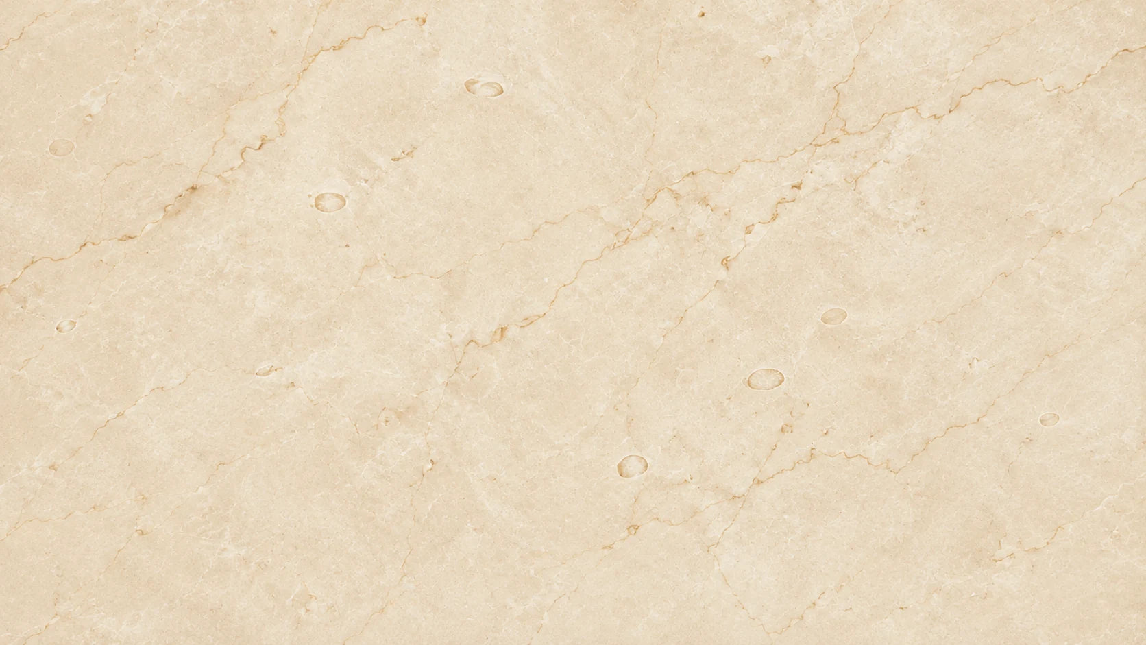
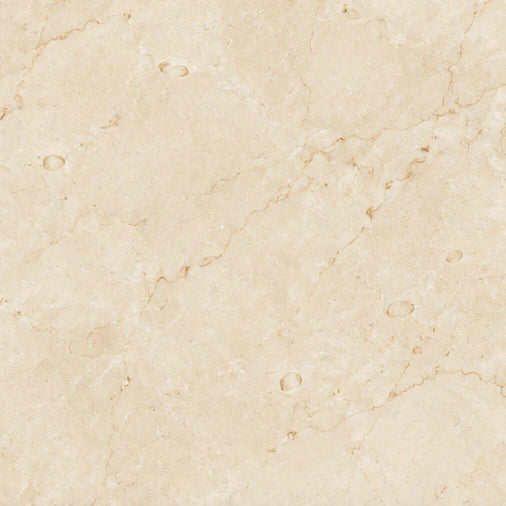
Material notes
Reading a cream floor
The fainter lines tend to disappear from a standing height. Differences in cream tone between neighbouring pieces can remain visible across an entire room.
Hotel and commercial floors, walls, stairs.
Request numbered slab photos
At the drawing board
Ask for the proposed pieces laid out together, then compare them with your skirting and grout. Mark any stair risers or reception fronts where clusters of rounded marks would be distracting.
Botticino Classico adds warm patches and more pronounced seams. Compare Botticino Classico.
Palette and lot review
View the sample beside warm whites, honey-coloured timber or brass as well as any bright white trim. The trim can make the same cream look yellower.
Ask for a scale beside the rounded marks in a close-up. Agree how much clustering is acceptable on prominent risers or wall panels.
Plan the floor as a broad field
Crema Marfil is commonly considered for hotel and commercial floors, walls and stairs. On a large floor, buyers usually care less about any single piece and more about how the whole field reads from a distance. Tell us the total area, tile or slab format and laying pattern, and whether you prefer an even field or accept visible variation between pieces.
Check the adjacent palette
A beige field sits next to skirting, stair treads, borders and wall cladding. List the materials and colors planned for those neighbouring pieces, including any darker inlay or border stone. Ask for a review of pieces that will be laid side by side, and share photos or swatches of the surrounding finishes so the comparison happens in context.
Choose your slabs
Ask for current slab photographs and a finish sample. Include the area, piece sizes and any joints that need to line up.
Request Crema Marfil slabs Ask for a finish sample Prepare your inquiry